Apple
Visual elements in a text: Its shape is in rectangle. Two colors, grey and black. very simplistic genre. Average size, not small, not big.
The Apple webpage is balanced between images and text. The big image is on top left, text on the right, and three small images under the text. The iPhone 5 stand out. Image and text is in black. Every other thing is in grey. The page is designed so that we can notice only the image of the product. The web designer is making it so simple. They want us to know more about it. Designer led us to click on the image if we want to know more about it. The front page just gives us the minimum information which causes curiosity.
They show the side of iPhone to show how thin it is, and then its features. The text is also thin (to emphasize the thinness). They are emphasizing iPhone since they use the word iPhone three times in the text. If it were smaller, it would not capture our eyes. If it were bigger, we would focus on many, not just one. The main thing about the page is the iPhone image and the word “iPhone”.
Fun Facts about Apple’s Demographic
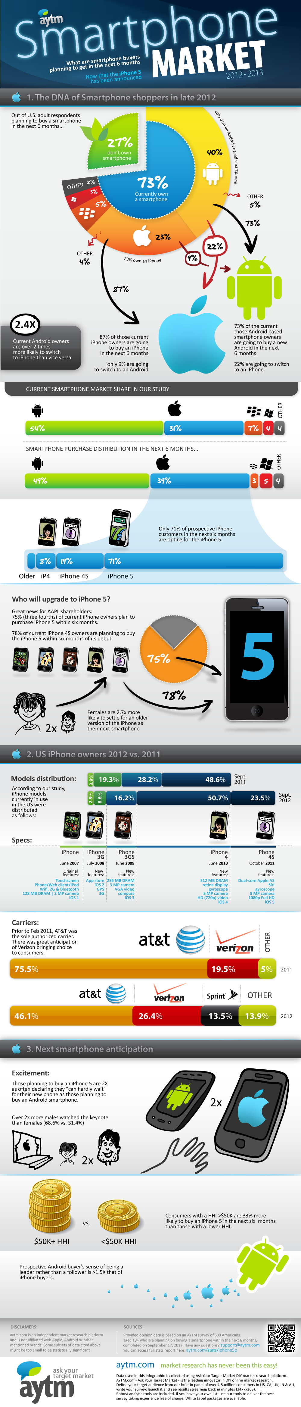
– 75% of the sales will be from previous users of iPhone.
– Half the audience is male. One third is aged between 18-24.
http://purplejunction.com/2012/09/23/iphone-5-demographics-and-trends